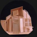
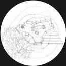
STORIES OF HOUSES feature examples of dwellings from which we can all learn - both the clients during their contemplation about building a house, and the architects to understand and evaluate the life of the clients.

How can an architect design a house for his older sister who has just become a widow? What can an architect offer when his client, who is confined to a wheelchair, asks for a complex design that will become his world? And when art lovers offer total freedom for the design of their house? How is one to explain that the neighbours once shot at the house of the architect who now has acclaimed international prestige?
This series of articles tries to give answers to questions concerning intimacies and origins of important international houses. They try to fill the gap left by so many History of Architecture books which, when neglecting these extreme personal sources, forget the multidisciplinary character of architecture. The houses analysed have been selected for their good architecture and for having been designed by a famous architect. But more than that, there is also an indispensable ingredient of having clients tell a passionate story that generates the project. Stories of Houses include information about the clients, their requests and needs, without which one cannot begin to understand the final result.

Contemporary houses
From Laugier's hut, which illustrates primitive architecture, to the houses by such architects as Ábalos and Herreros which are based on the idea behind the Swatch watches, through to the House of the Future, a project by the couple Alison and Peter Smithson, the study of housing has been linked to the time in which it was built. Beyond styles or fashions, Stories of Houses deals with feelings and passions which help to establish an analysis detached from the time to which it belongs. They are examples of architecture which will always be up-to-date, bearing in mind that they are concerned with personal feelings with which we all identify.
The elaboration of the program for the dwelling, which is articulated by the clients, is a process that is later reversed when the house moulds the life of its inhabitants. The furniture, memories, inherited objects and collections are all symbols of what we are and what we want to be. One could argue that if the facades of the houses are the interior of the city, then the interior of the houses are the exterior of their inhabitants. Thus, the history of the dwelling derives from the plurality of society in which it is built, from the architect's education and imagination and the life of the user. In short, the articles are concerned with recovering an intense connection between the client and the architect.
The published material has the rigour of having been revised and accepted by the architects of the houses. The articles are about recently built houses - although some now are demolished - and in only one case, there will be an un-built project. This is by the Spanish architect Enric Miralles, whose recent death did not allow him to complete it. To him we dedicate these articles.

Captions for illustrations
A. Marc-Antoine Laugier, The primitive hut, in Essay on Architecture (Paris 1753).
B. The House of the Future by Alison and Peter Smithson was presented in the annual exhibition Ideal House organised in 1956 by the newspaper The Daily Mail in London. It was a mass produced house that anticipated what would become available in 25 years time.
C. The AH houses by the architects Iñaki Ábalos and Juan Herreros (1994) react to the conventional dwelling, changing their images according to the environment in which they are placed.
D. The facades of the houses are the interior of the city. View of Reykjavik
E. Town house of the architect John Soane, built in London at the beginning of the nineteenth-century. Some of its interior space exteriorises its inhabitants.

Small House for a Kolonihaven, by Enric Miralles


In 1996 the Spanish architect Enric Miralles was asked to design a little wooden house near Copenhagen, a project that he elaborated with his wife, Benedetta Tagliabue. The result was a house that came to reflect a family lifetime.
The present article is the only one of the collection STORIES OF HOUSES that deals with a project that has not been built. Although the recent death from cancer did not allow the young Miralles to conclude the house, the value of the project goes beyond its materiality.

Building time
There still continues an old tradition in Denmark of building minute houses, or allotments, in the market gardens at the outskirts of towns. These housing developments are called Kolonihaven and their sole function is to shelter their owners from the cold and rain when spending time close to nature. The new Kolonihaven near Copenhagen groups a diversity of small houses between cherry trees. They are works of fourteen renowned architects who where invited to build distinctive retreats with the only condition not to surpass 6 m2 of ground.
The couple Miralles and Tagliabue generated their project from their interest in recording the passage of time. From that starting point, the architects explained, "the house becomes a calendar". It is a place to feel time passing when looking at nature, while the parents talk around a table and the children play their games. Along with the drawings and models, the architects illustrated their explanations bringing a German almanac that shows the flowers of the different months of the year, with their timing of opening and closing each day: chicory in the mornings of February, water-lilies in those of June, marigolds during the days of September and opened carnations in all December.
The passage of time is also recorded while sketching the plan of the little house. Enric and Benedetta gave their small daughter a miniature chair and she started to play with it, taking her first steps with it and moving it. Like if trying to draw these movements on the floor, the parents generated the plan of the house. From its limits a timber framework was brought to life which forms the volumes which embraces, exactly like a dress, the movement of the girl with her chair and the adults sitting around the table.
At this point in the design process, the architects brought an old drawing by the architect Le Corbusier where a girl asks an adult to play with her, inviting him to enter a house through a small door to the world at her size. The house in Kolonihaven varies in height. It has a very low ceiling in the children's room but becomes higher by the sitting room for adults. Seen through its section, the house captures this passage of time - the house grows with the inhabitant, from being a child to become an adult.

1955-2000
The theme of this project for a tiny shelter lies in dealing with the passage of time, with life itself. Its function is precisely that, and nothing more. If the saying is true that an architect can be measured from his project for a single house, then in designing a small wooden house for a Kolonihaven one could measure the architect as a person. In such a project, the architect is commissioned to describe his vision of life, to see time pass by.
Because of this reason, perhaps, Enric Miralles included his little daughter in the development of the house in Kolonihaven and acknowledged her as a collaborator, naming her in the list of the project team. It was a confusion of his private and professional lives, something that Enric had always done.

Captions for illustrations
1. Enric Miralles (1955-2000) and Benedetta Tagliabue (n. 1963), architects. (Photo:Giovanni Zanzi)
2. "The house becomes a calendar."
3. Enric always liked to explain his projects with an allegorical tale. Here, the Kolonihaven house "is a miniature stone in a bonsai landscape."
4. A little girl taking her first steps with a help of a small chair.
5. The tiny house has two entrances; one of which is a miniature door for the child.
6. A model in soap.
7. The house was like a dress that embraced both the movements of the child and the parents.
Photo: Alex Gaultier


'Maison à Bordeaux', by Rem Koolhaas


A wealthy married couple with three children lived in a very old and beautiful house in Bordeaux in France. For many years this family was thinking about building a new home, planning how it could be and wondering who the architect would be. Suddenly, the husband had a car accident and almost lost his life. Now he needs a wheelchair. The old beautiful house and the medieval city of Bordeaux had now become a prison for him. The family started to think about their new house again but this time in a very different way.

Circulation in the new house.
The married couple bought a hill with a panoramic view over the city and approached the Dutch architect Rem Koolhaas in 1994. The husband explained to him: "Contrary to what you might expect, I do not want a simple house. I want a complicated house because it will determine my world."
Instead of designing a house on one floor which would ease the movements of the wheelchair, the architect surprised them with an idea of a house on three levels, one on top of each other. The ground floor, half-carved into the hill, accommodates the kitchen and television room, and leads to a courtyard. The bedrooms of the family are on the top floor, built as a dark concrete box. In the middle of these two levels is the living room made of glass where one contemplates the valley of the river Garonne and Bordeaux's clear outline.
The wheelchair has access to these levels by an elevator platform that is the size of a room, and is actually a well-equipped office. Because of its vertical movements, the platform becomes part of the kitchen when it is on the ground floor; links with the aluminium floor on the middle level and creates a relaxed working space in the master bedroom on the top floor. In the same way that the wheelchair can be interpreted as an extension of the body, the elevator platform, created by the architect, is an indispensable part of the handicapped client. This offers him more possibilities of mobility than to any other member of the family- only he has access to spaces like the wine cellar or the bookshelves made of polycarbonate which span from the ground floor to the top of the house, and thus respond to the movement of the platform.

Experiencing the house.
Koolhaas designed a complex house in itself and surpassed the conventional, in every detail. For example, the top floor rests on three legs. One of these legs, a cylinder that includes the circular staircase of the house, is located off-centre. Although this displacement brings an instability to the house, it gains equilibrium by placing a steel beam over the house which pulls a cable in tension. The first question that the visitor asks is: what happens if the cord is cut? Koolhaas has created a structure which, equal to the life of the client, depends on a cable.
This arrangement provides the middle level with an uninterrupted view over the surrounding landscape, and an effect that is intensified with the highly polished finish of the stainless steel cylinder which incorporates the stairs, and makes it disappear into the landscape. The middle level is a balcony where the top floor floats above. It is a glazed space which allows the wheelchair to confuse the nature outside with the interior of the house. In contrast, the same landscape receives another treatment from the top floor. The view appears restricted and predetermined, framed by circular windows placed according to whether one stands, sits or lays down.
Inside the house the family experiences Koolhaas's interpretations of life's instability and dualities. In regards to the husband, he has experienced this instability and is now part of his own self. In the same way that the umbilical cord belongs both to the mother and the baby, and gives it nutrition; the elevator platform connects the husband to the house and offers him a liberation.

Appendix. It was with the greatest sorrow that we learnt, at the beginning of the year 2001, of the husband's death.

Photos: Hans Werlemann
Captions for illustrations
1. Rem Koolhaas (b. 1944). (Photo: Sanne Peper)
2. Working model for the 'Maison à Bordeaux'.
3. The architect surprised the family with an idea of a house on three levels, one on top of each other.
4. The husband has access to all three levels with an elevator platform which is the size of a room, 3 x 3,5m.
5. Bookshelves spanning three levels respond to the needs of the mobile office.
6. The middle level is a glass space which allows the wheelchair to confuse the nature outside with the interior of the dwelling.


Miranda Santos House, by Álvaro Siza


At the beginning of the 1960's, the Portuguese architect, Álvaro Siza, designed a house for a writer in Matosinhos, Porto. Since then, there have been several changes in its ownership but Siza has continued to be the architect throughout and has been in charge of all its alterations, additions and new furniture. Now, due to external circumstances, the house fulfils all the requirements to be a museum of the architect.

The owners of the house
The writer Luisa Ferreira da Costa commissioned the young Álvaro Siza in 1962 to design a house in a dense neighbourhood of small plots. Costa asked for privacy and seclusion, and requested low, indirect light suitable for her writing. Siza responded by providing a two-storey house with skylights to create diffuse overhead light and small windows in the elevations to simply provide views of orientation and reference. He made use of the architectural vernacular, using mono pitched tiled roofs and plastered structural granite walls. This produced simplicity of volumes, a quality of composition reinforced by meticulous constructional details with openings framed in thick timbers, untreated to retain their natural colour.
The house changed ownership in 1987. Its new proprietor, Miranda Dos Santos, commissioned Siza to make alterations which consisted of enlarging existing windows and making new ones as a reaction against the new owner's perception of the dim light of the skylights. These new openings were detailed differently from the original construction. It was as if Siza was marking his own evolution by adding new materials: the new window openings were framed with white painted wood in white marble cases.
Shortly afterwards, the house passed to Santos' son, an engineer who also asked Siza to continue working with the house, but this time, by designing all its furniture. His commission was not to ask Siza for 'artistic' objects, but rather to fulfil his practical requirements.

The transformation of the house
During this long history of change of proprietors, Siza's had been acquiring an international acclaim with a long list of celebrated works, he had lectured at numerous universities, exhibited his work almost all over the world, and received the most prestigious awards and prizes. Consequently, it is not hard to imagine the tremendous difficulty Santos's son had, trying to achieve his aim. For years he literally hounded Siza to the point where he recognised his "extraordinary, I might say almost excessive, admiration for the architect and his work". He accompanied Siza on his way to work and even drove him to and from the airport, snatching brief moments of the architect's time in order to get hold of a sketch, an idea, a correction or his approval.
Up to now, Álvaro Siza has designed for the house an extensive list of furniture and fittings: steel arm lamps both in the wall and floor versions, a table lamp with a shade formed by a thin sheet of bent wood, a dining table with glass top edged in wood, several cherry-wood chests-of-drawers with handles that automatically retract by an inner counterweight, welsh dressers with the sides in pale marble that contrasts with the mahogany veneer, a round table in marble with a central steel leg, three-legged chairs whose seats are tapered to allow better use of the round table, glass-fronted bookcase-cabinets with a writing desk, a wall-lamp obtained simply from a plain sheet of bent wood, a floor lamp screened with a translucent marble disc, a chest-of-drawers which acts as the headboard and frame of the bed, a dressing-table, a bedside-chest with simply screened lamp, a single-drawer bedside table, a full collection of accessories for the bathroom, and even the design of two types of door and cupboard keys.
Now-a-days, almost all of the furniture is being mass-produced, the reproductions have become highly popular and are even exhibited in design museums. The simple solutions for furnishing the Miranda Santos House have now become original prototypes. This is a new stage in the life of the house, the house to become understood as a museum of the architect's furniture displayed within his own architecture. Indeed, as it were a retrospective exhibition at the house, a portrait of the architect greets our visit.

Photos: Luis Ferreira Alves, Alvaro Siza and Alessandra Chemollo.
1. Plan of the reformed house for Miranda Dos Santos in 1987.
2. The different openings in the white walls show the evolution of Siza's architecture.
3. Although the commissions of furniture for the Miranda Santos House finished in 1996, its owner has continued acquiring more designs from the architect; such as the mirror Álvaro, the ashtray Havana, and a garden chaise-longue.
4. Keys for doors and cupboards.
5. View from the corridor on the 1st floor with the furniture and a photograph of the architect. In the last photograph we know of the house, a poster sized portrait of Álvaro Siza Vieira (b. 1933) presides the living-room.

Villa Anbar in Dammam, by Peter Barber


A romantic novelist from Saudi Arabia approached the British architect, Peter Barber, in 1992 to design her house in the important commercial and port city, Dammam, in the Arabian Gulf. Mrs Anbar - a widow - divided her year between London and her native country, therefore her attitude towards Middle Eastern culture was characterised by cosmopolitan influences. On the other hand, as a Western architect designing in Saudi Arabia, Barber had to research the complexities of Islamic culture.

The interior of Saudi domestic houses
The traditional typology of interiors in Saudi houses reflects a profound sense of hierarchy between men and women. It is a rigid issue of segregation between sexes which is echoed in the two entrances to the house, and is followed up in the interior by separating men's and women's quarters. The degree of separation is further dec
lared - between servants and members of the family, and between the family and the outside world - by a series of increasingly private spaces which gravitate towards a central courtyard.
Undoubtedly, the context in which the villa Anbar was going to be built was not neutral. Political and religious leaders had far more power over architecture than even the architects themselves. Indeed, during the construction of the house, a nearby medieval settlement was razed to the ground by the government simply because its spatial complexity of tight alleyways and small squares created a problem of control for the authorities.
Faced with this unfamiliar environment, the English architect acknowledged that a close reading of the books Beyond the Veil, by Fatima Mernissi, and Sexuality and Space by Beatriz Colomina was influential in approaching the programme of the house. From that moment, the programme not only became to specify the rooms required by Mrs Anbar, her children and grandchildren, but also, and above all, to understand the house as a political space.

The profundity of the gaze
Peter Barber investigated the power of the gaze to determine the division of space in domestic architecture. From the most public area to the most private one, the eye was directed in very specific paths through different layers, either giving a full view or only a partial one, sometimes merely implying what could be seen.
At the entrance, a gate gives a view into the courtyard, although a wall to the right prevents the gaze penetrating any further. The threshold is defined by a lintel that slips over the top of the wall. This lintel shows a dual aspect, a technical one of taking water to the swimming pool on the other side of the wall, and a metaphorical one of framing the gaze so as to give a hint of something else beyond. As one passes the entrance, tiny openings cut through the front wall of the house and signal the presence of the unseen occupants.
Although internally the house follows a traditional layout of separating men and women's quarters, this structure is broken by simple acts. Thus, as a crack, a horizontal cut in a wall of the women's quarter serves as a vantage-point for surveying the unseen, that is, the male domain. As might have been expected, male members of the family demanded that a shutter would be placed over the frame. This was done but, paradoxically, it was allocated on the women's side.
Opposite the pool, the driver's dwelling is placed on the first level projecting over the private garden. Looking down from his window, his gaze touches on the most private space of the family, in their time of leisure. Even if the window were to be blocked up, the presence of the servant would always be felt due to the volume of his room. However, the presence of the maid is more oblique. Her room, which is placed on the roof terrace and thus away from the family's private rooms, is connected to the central courtyard through a series of cuts. In that way, her gaze is allowed to penetrate into the symbolic heart of the house.
While Barber builds according to the usual gender and class boundaries demanded by Muslim society, he subverts these boundaries with gentle questions rather than formulating them in an obvious manner. This is an architecture that goes beyond formalistic considerations, that introduces a certain ambiguity which in turns initiates questions about social conditions and changes.

Photos: Peter Barber Associates
Captions for illustrations
a. Peter Barber (b. 1960) architect.
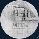
b. Ground floor of Villa Anbar: 0. Entrance, 1. Women's living room, 2 Men's living room, 3. Dining room, 4. Shower, 5. Toilets, 6. Kitchen, 7 Bedroom, 8. Courtyard, 9. Garage, 10. Maid's room, 11. Laundry, 12. Installations, 13. Driver's room.
c. The house has only one entrance from the street - partly due to the client's status as a widow. The visitors of both sexes cross in this space, where the sound of the water conveys the presence of the family in the swimming pool.
g. Window looking onto the men's living room from the women's living room.
i. Men's living room.

Can Lis and Can Feliz in Mallorca, by Jørn Utzon


After having to abandon the construction of the Sidney Opera House in 1966, the Danish architect Jørn Utzon on his way home, made an intermediate stop at Mallorca. The island fascinated him to such a degree that he decided to build a summer house there. It was located facing the Mediterranean, on a cliff near a small fishing village and he gave it the name of his wife, Lis. In 1994, he felt obliged to move from his house, which had turned into a place of pilgrimage for architects. Utzon built another house, Can Feliz, also in Mallorca, but this time its location is kept a total secret.

Can Lis
Jørn Utzon had been affected, at the beginning of his career, when he learnt that the celebrated Swedish architect, Gunnar Asplund, had died of stress. On his death bed, Asplund asked his son whether all this effort had really been worth while. These words came back to Utzon years later when, after he had been nine years working on the design and building his winning project of the Sidney Opera House, he decided to resign from this job because he had not been shown professional respect by the Ministry of Public Works. Since then, Utzon has never returned to Australia to see his building finished.
Looking, in Porto Pietro, for an ideal refuge during his holidays, Utzon built Can Lis in 1972, set among myrtle and pine trees, with an extraordinary view to the sea. Integrating with the colours in the landscape, the main building material is a hard local limestone, called marés stone, which varies from gold to pink in colour. The original concept for the house was the same as for the one that Utzon had intended to build in Sidney; a sequence of pavilions linked by a wall, and arranged so as to respond to the various functions within the dwelling. He explained it with a story by Karen Blixen about African farmers where she said: "It was impossible for them to build their houses in a uniform row because they followed an order that was based on the position of the sun, the places of the trees and the natural mutual relationships of the buildings." The orientation of the pavilions in Can Lis selects distinctive views of the Mediterranean, and consequently, the furniture became fixed, built on site and finished with shiny ceramic tiles. Additionally, as the window frames were mounted on the outside surface of the walls, they were made invisible from the interior, which again, stimulates the effect of light, blurring the limits between the dark interior of the house and the blistering Mediterranean sun. For all these reasons, family life follows a route as the day passes which seems to pursue the passage of the sun.

Can Feliz
Utzon developed a new typology for housing in Can Lis, the house of the sun, from which we all have a lot to learn. In fact, the architect told us, with a smile, about the numerous visits of buses full of tourists arriving to this house.
Twenty-two years had passed from the construction of Can Lis when Jørn Utzon and his wife decided to spend the majority of the year in Mallorca. Due to the high humidity in winters, they handed Can Lis to their children and moved to a new house that they named Can Feliz. It is in the mountains, far away from the humid sea breezes, with big windows overlooking the green pine grove that reaches down to the sea.
Although both houses use the same materials, the second is a house in the mountains that belongs more to the traditional houses of the island, even reaching the point of being passed by unnoticed. Can Feliz is built round a terrace, following the pattern of orthogonal axis and is built under one tiled roof.
However much Utzon has insisted on his joy at receiving visitors, the fact that the house is so difficult to locate has contributed to the creation of the myth of the badly treated architect who has retreated into his refuge. Can Feliz has appeared in publication as it were a magical place and, includes, of course, the indispensable requirement of any utopia, apart from it marvellous qualities, be an insuperable gap from the rest of the world. In the same way as any novel on magic lands starts - with the loss of memory of the shipwrecked person who does not know how he arrived on the island, or the predicable cough made by the servant right in the moment when the narrator reveals the secret coordinates - the published articles on Can Feliz are reports by visitors who affirm that they are not able to remember the way that leads to the house.

Photos: Søren Kuhn
Captions for illustrations
a. Jørn Utzon (b. 1918) architect, at Can Feliz.
b. Looking for an ideal refuge, Utzon built the peaceful Can Lis, set among myrtle and pine trees, with an extraordinary view to the sea.
c. Can Lis. 1. court, 2. dining area, 3. kitchen, 4. work room, 5. entry, 6. covered terrace, 7. living room, 8. bedroom.
d. The semi-circular sofa in the living room of Can Lis follows the sun on the horizon while at sunset one ends up looking into the fire in fireplace.
e. Can Feliz. 1. entrance, 2. entry, 3. court, 4. work room, 5. living room, 6. kitchen, 7. dining room, 8. covered terrace, 9. bedroom, 10. terrace, 11. swimming pool.
f. Shiny ceramic tiles in the kitchen at Can Feliz refer to traditional building methods on the island.

The U-House in Tokyo, by Toyo Ito


The U-House was built in 1976 in the centre of Tokyo. It was designed by the architect Toyo Ito for his older sister, who had just lost her husband to cancer. In 1997 the house was demolished before Toyo Ito's eyes. How does one explain such an ending?

The Mourners' wishes
The client and her family had lived in one of the city's high-rise apartment. Following her husband's death, the widow requested that the architect build a house for her and her small daughters where they could enjoy the close contact with the soil and plants that their former home had lacked. She also suggested that the house be L-shaped to enable all members of the family to have visual contact with one another. By coincidence, the site next to the architect's house was for sale - the same site on which the widow had lived before she was married. It was as if she wanted to grasp hold of her memories in order to help reunite her family during such a difficult time.
In the widow's conversations with the architect, the emphasis on organising functional spaces gradually disappeared and instead turned more towards the symbolic value of the space. Thus the house changed its initial L-shape to become a concrete construction with a U-shape, a form that would create greater light effects and a stronger relationship between the inhabitants.

The life of the house
The U-House consisted of two long corridors, one of which ended at the girls' rooms, the other of which led through the kitchen and bathroom and onto the mother's bedroom. Both of the corridors were dark and led into the light - a source originating from the arc of the U. This multi-use space used for playing, dining and meditating, had its walls and ceiling painted white and floor covered with a carpet, also white. In this space the light was diffused and gave a soft texture, but a cut in the ceiling directed the daylight in a straight diagonal line. The powerful light effects were reinforced by the pure whiteness of the interior, which seemed flat and without any three-dimensionality. It was like a screen where the images and floating shadows of the inhabitants were projected; a space to project the human being beyond his or her body.
Twenty-one years after the completion of the house, the family was ready to re-establish its links with the outside world. The first one to move away was the older daughter. She had never thought of whether or not it was comfortable to live in the house, although she refers to the house as a coffin. This was perhaps best reflected by the behaviour of her many pets, all of whom had totally refused to be alone in the enclosed courtyard. The mother later moved to a smaller flat, but being a musicologist she had enjoyed the music echoing on the bare walls in the old house. The youngest daughter was the last to move out. She had developed certain sensitivity for aesthetics in this house that was reflected in her appreciation of Kandinsky and later, her eventual position as a museum director.
The last thing we know about the story of the house is from a powerful image in a photograph that illustrates its demolition. Instead of interpreting it as a destruction of a home, it is a sign of another stage through which the family progresses. The demolition is a symbol of renewal of life and consequently, we can argue that this was a house for mourners.

Photos: Tomio Ohashi
Captions for illustrations
A. Toyo Ito (b. 1941) architect.
B. One of the widow's desires was for visual contact between each member of the family.
C. Plan of the U-House.
D. A screen where the images and floating shadows of the inhabitants were projected.
E. The life of the house.
F. Demolition of the house in 1997.